Horror is not a genre I delve into often, but I figured it's always good to branch out. This creature gives me the chance to do some fairly realistic figure work, and also to take a rather ridiculous monster and try my hand at making it a bit more scary.
My first step was to find a good source image for the pose. I wanted a fairly natural pose, but one that would look slightly "off" in its stance, once I did away with the head. This photo from Felixdeon on dA fit the bill perfectly. The lighting in the shot is also pretty interesting, which is a bonus.
With a pose selected, my next step was to begin my sketch. Starting out rough and gestural is the best way to begin. It's so much easier to fix mistakes when you're at this stage, than when you're five hours into the painting.
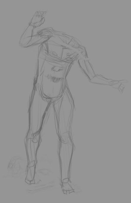
Next, I refined my lines and started adding some background objects for interest. The bones are based on various pics from Skulls Unlimited.
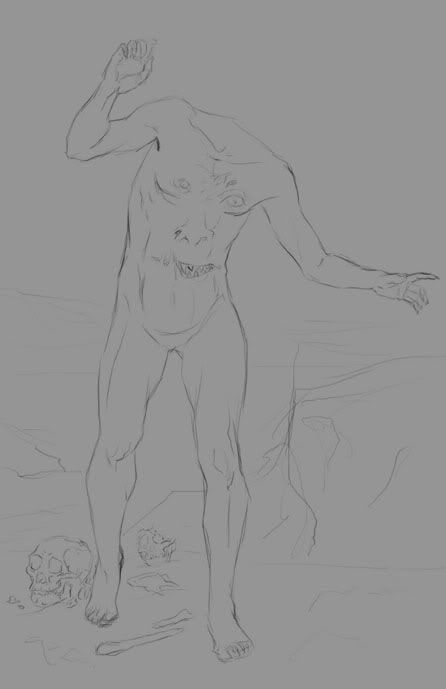
I felt pleased with the figure at this point. But as a monster, the image was definitely lacking creepiness. Instead of going for a bloody, gory "ick," I decided to take a different route, and over-emphasize the musculature, veins, and tendons. While muscles are normally thought of as attractive in Western aesthetics, you can take it far enough that it becomes grotesque. For reference, I looked up musculature diagrams and drawings by Michaelangelo. An art instructor of mine once joked that an arm on a Michaelangelo figure looks like a bag of walnuts, because you can see every single muscle. Sounds like a good start towards creepy!
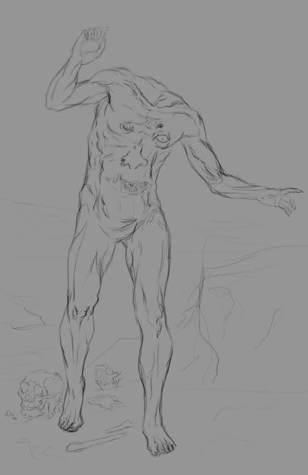
And there we have it! The finished drawing for the figure and a loose background. For the coloring, I referred back to my stock again. (I hope you can all forgive me the sin of censorship, but I'm hosting my images on Photobucket.)
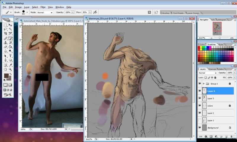
I gave my creature a pale skintone, firstly because it's easiest to match the model, and secondly because veins show best under paler skin.
Despite the skin being pale, though, it's by no means different shades of the same color. It's a combination of several hues. The lights are mostly yellow-oranges, with orange-reds for the midtones, and red-purples for the darks. There are some blues worked into the darks, as well. As I said in my last post, it's really important to use complementary colors.
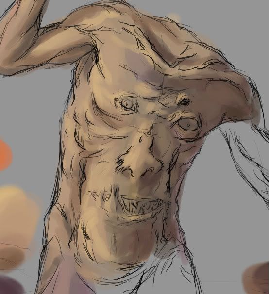
To begin, I'm just roughly applying color. The play of light is similar to the lighting on the model, but the more exaggerated muscles, (as well as the face, obviously) change things a bit.
Here's a detail view.
That's all for part one! I'll continue with more work on painting the figure and details in Part Two.

0 comments:
Post a Comment