Showing posts with label bones. Show all posts

Sunday, February 28, 2010

Monster Time! Part 2

Continuing from Part 1, it's time to do the environment and detail work.

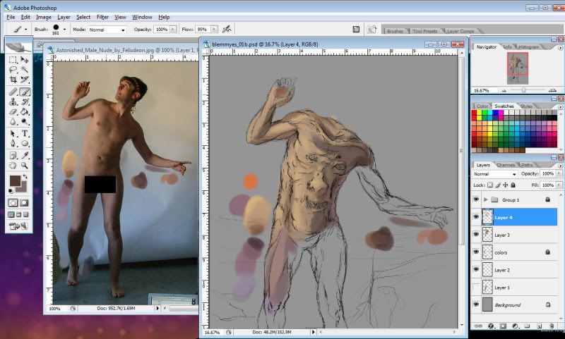
The first thing to do is finish laying down rough colors as before. It's important right now to make sure the entire figure is covered with the general colors it should have; it's not important that the brush strokes look nice.


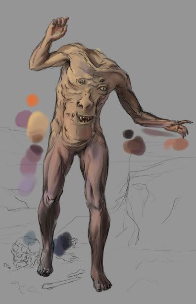
Next, it's time to sketch in a background and add some rough colors to it, as well. This is where the previous step becomes important. Harmony is very important in figurative works. The composition should be balanced, and so should the colors. You want to ensure that the less important areas of the painting don't "compete" with the more important areas, visually. In this painting, the creature is the focus, so it needs to stand out from the background without seeming to "jump out" from the image.


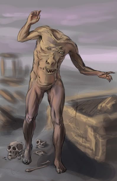
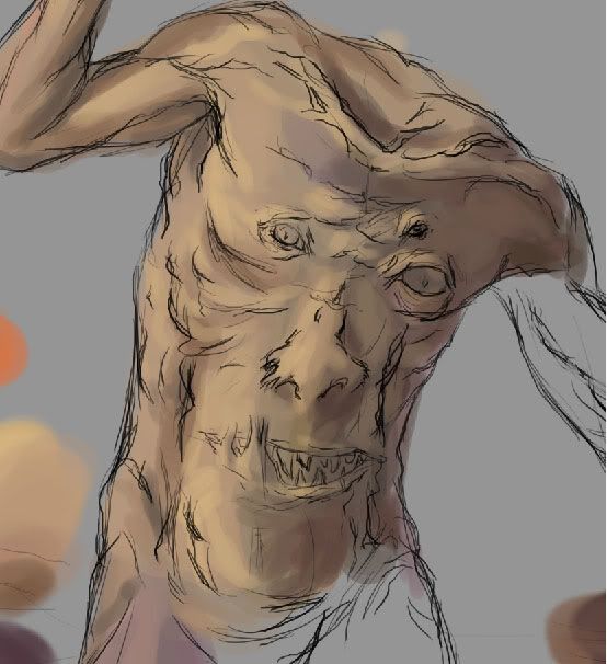
Now is the time when you should really critique the formal elements of your painting. It'll be much easier to fix mistakes now, than later. I'm pretty satisfied with the composition and colors of this piece, so I'm going to begin painting details.


My first concern in this step is to get rid of all my sketch lines. I'm using my regular default brush for this, with the opacity jitter and flow jitter set to my pen pressure. By varying those controls, I can smooth out the rough colors quickly. In areas that need soft transitions between color and shape, I keep my brush at a fairly large size; tighter areas call for a smaller brush.

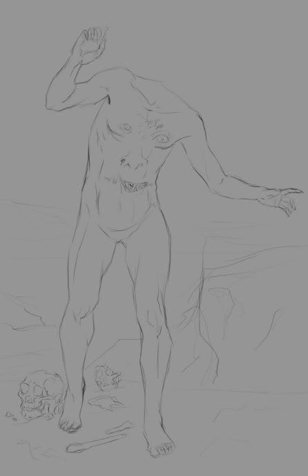
I also spent some time on the bones. Because they're so close to the figure, they need to be just as detailed as him. For reference, I perused "Skulls Unlimited."


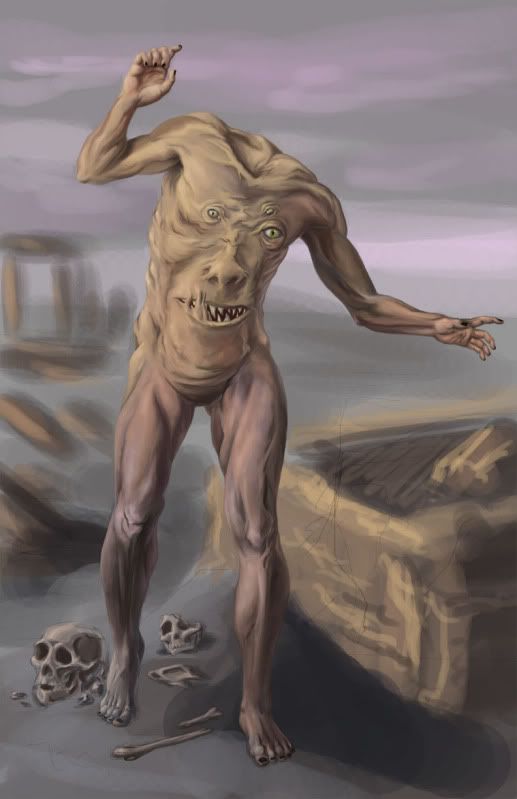
Now comes the really long part of this painting. From here on, it's mostly more of the same work as before. I took more time to refine and polish the figure, and began more detail work on the environment. The environment has a sort of Greco-Roman architecture to it, with lots of columns. In the background, there are a couple of small temple structures. The sky is a little more refined, and way off in the distance is the silhouette of a town. I also added some vases and bits of grass in the foreground for interest.


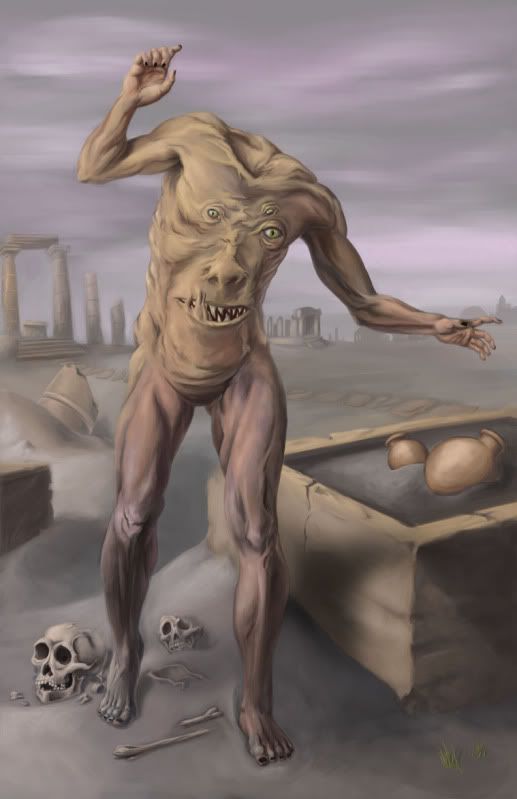
That's about 99% of the painting. Whenever I get this much of a painting finished I like to take a break and then give it a second look to see what else I can do. One of the last things I did was to "break" the vases. Hellcat pointed out that it didn't look right to have them intact when everything else around is broken and decaying. Sometimes, just doing little things like that really make a painting.


And voila! It's finished!

Tuesday, January 5, 2010

Monster time! Part 1

Often, I like to work on several images in parallel to keep myself from getting bored or tired of a single painting. So, today, I started a new one, based on the Greek anthropophage and depictions of the legendary Blemmyes creature.

Horror is not a genre I delve into often, but I figured it's always good to branch out. This creature gives me the chance to do some fairly realistic figure work, and also to take a rather ridiculous monster and try my hand at making it a bit more scary.

My first step was to find a good source image for the pose. I wanted a fairly natural pose, but one that would look slightly "off" in its stance, once I did away with the head. This photo from Felixdeon on dA fit the bill perfectly. The lighting in the shot is also pretty interesting, which is a bonus.

With a pose selected, my next step was to begin my sketch. Starting out rough and gestural is the best way to begin. It's so much easier to fix mistakes when you're at this stage, than when you're five hours into the painting.


Next, I refined my lines and started adding some background objects for interest. The bones are based on various pics from Skulls Unlimited.


I felt pleased with the figure at this point. But as a monster, the image was definitely lacking creepiness. Instead of going for a bloody, gory "ick," I decided to take a different route, and over-emphasize the musculature, veins, and tendons. While muscles are normally thought of as attractive in Western aesthetics, you can take it far enough that it becomes grotesque. For reference, I looked up musculature diagrams and drawings by Michaelangelo. An art instructor of mine once joked that an arm on a Michaelangelo figure looks like a bag of walnuts, because you can see every single muscle. Sounds like a good start towards creepy!


And there we have it! The finished drawing for the figure and a loose background. For the coloring, I referred back to my stock again. (I hope you can all forgive me the sin of censorship, but I'm hosting my images on Photobucket.)


I gave my creature a pale skintone, firstly because it's easiest to match the model, and secondly because veins show best under paler skin.

Despite the skin being pale, though, it's by no means different shades of the same color. It's a combination of several hues. The lights are mostly yellow-oranges, with orange-reds for the midtones, and red-purples for the darks. There are some blues worked into the darks, as well. As I said in my last post, it's really important to use complementary colors.

To begin, I'm just roughly applying color. The play of light is similar to the lighting on the model, but the more exaggerated muscles, (as well as the face, obviously) change things a bit.

Here's a detail view.


That's all for part one! I'll continue with more work on painting the figure and details in Part Two.