Friday, June 24, 2011

A New Rating System


The SMRSNH (Scientific Movie Rating System for Nerdy Hipsters) is based on the stellar classification system. Instead of giving a number of stars to a movie, you compare films to types of celestial objects. A list, with examples*, follows below.

*YMMV. Examples are based on critical ratings, and are not guaranteed to be underground.

  • O-type "Blue"
    • Members of this type are extremely hot, as well as a very rare. These are the masterpieces, the gems that outshine all the others, and one that will go down in the history books. (Ex. "Citizen Kane")
  • B-type "Blue-white"
    • Make a point to see this one before it blinks out. It's an impressive sight, and one you won't regret. (Ex. "Toy Story")
  • A-type "White"
    • Bright, entertaining, and energetic, and one you'll most likely enjoy. (Ex. "Star Wars Episode IV")
  • F-type "Yellow-white"
    • Though not quite as hot as the others, this one will still make for a good night out. (Ex. "Coraline")
  • G-type  "Yellow"
    • You see this kind of thing every day, and there are plenty more where it came from. It's not exactly the lowest common denominator, but it's still not outstanding. (Ex. "Top Gun")
  • K-type "Orange"
    • You might be able to enjoy this one if you don't set your expectations too high. It's a dime a dozen, and you'll probably soon tire of seeing its kind. (Ex. "Constantine")
  • M-type "Red dwarf"
    • Ah, this is stable, predictable, common—and base. Don't worry about missing out if you skip one of these. There are too many to count, and they won't die off any time soon. (Ex. "Land of the Lost")
  • L-type "Brown dwarf"
    • Despite the hype, it ultimately never amounted to anything and probably never will. Often starting with great raw material, the end result is less than stellar. (Ex. "The Last Airbender")
  • D-type "White dwarf"
    • First it collapsed, but now it's shining brighter than ever! This thing might have seemed like a failure, but somehow, it's still going—and getting more attention than ever. (Ex. "The Room")
  • Neutron star
    • This one is bright, but also incredibly dense. You've heard a lot of people get excited about this, but it's rather puzzling. (Ex. "2001: A Space Odyssey")
  • Black Hole
    • It sucks—period. There is absolutely no light in this, and you'd be lucky to escape. (Ex. "Baby Geniuses")
  • Supermassive Black Hole
    • Mysterious, infamous entities spoken of in hushed tones and rarely seen. It's better that way, really. These are dangerous. (Ex. "The Star Wars holiday Special")

Thursday, June 16, 2011

Weekly Sketches

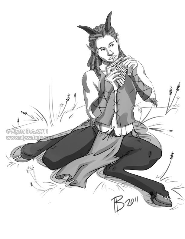
Here's a little bit of what I've been working on, over the past week. After finishing up Sobel, I did a character sketch of Myron.


I spent a lot more time on this one, playing around with a larger scene. Ultimately, though, I scrapped the idea and went back to the simpler spot illustration style I used with Sobel. It was a little frustrating at first. I felt as though I'd wasted a lot of time fiddling around with something that didn't make it into the piece. Then I remembered how Tom Jech advised us, when he visited BGSU this past semester, that the difference between student and professional work is often what you don't include. It's good advice that I think I'm starting to internalize.

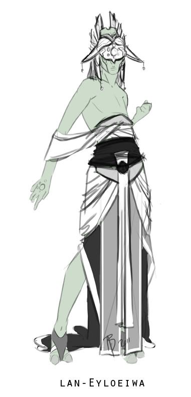
The next sketch that I worked on is a few months older: the clothing design for the High Priestess of the Syäloä, län-Eyloeiwä I started this one at the same time as the others, but felt unsure about how to finalize the design. I spent a few minutes on it again this week, and feel quite confident about the design. She shares some elements of dress with the temple guardians. This also shows, when compared with the other outfits, a cultural element of hierarchy through dress--the higher an individual's status, the more clothing they wear. This is a common practice in many real-world societies.


You can see the previous clothing concepts here; the Temple Guardian here; and the High Priestess here.

Thursday, June 9, 2011

A Quick Message

I've recently been polishing up Dr. Catalano's website, and he now has a blog, as well.

As a lot of my friends and classmates know, Dr. Catalano and his family will be going to China, soon, where he'll teach at Zhuhai International School. Unfortunately, they won't be able to take their two cats with them. So, if anyone would like to give a loving home to either of these animals, please check out this post, and get in touch with him.

Thursday, June 2, 2011

Sketchings

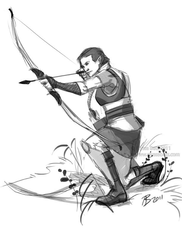
Remember these guys? Since I haven't done much with the characters since their initial designs, I decided some more illustration were in order. I picked Sobel first. Her sketch turned out to be a bit more of a challenge than I expected, but it was a very fun exercise and I learned something in doing it.

The first bit of trouble I ran into was the pose. Because I'm not an archer, I felt that going with a photo reference was a good idea. I wanted to get Sobel's position correct, and knew I'd get something wrong if I tried to draw from my head, or pose in front of a mirror. However, I picked a reference that wasn't too clear in some areas, and ended up paying for that. The face and right leg took the longest to adjust properly, balancing how the model was positioned against what looks correct. That's the "con" of the pose; the "pro" of course, is that it looks very dynamic. Another "pro" is that the model is wearing a sleeveless shirt, so the muscles are visible as the bow is being drawn. (Again, this is a case of photo being preferable to live reference; I am not that buff.)

Ernest helped me quite a bit. He's done about 500% more archery than I have (which is to say, any at all), and was able to give me some tips. One thing that I had completely neglected, initially, was a chest guard. I'd seen them before, but it never registered in my head what they were for. It's sort of ironic, though. In the initial design, I got some flak for not making Sobel's bust noticeable enough (under a chainmail shirt, I might add), so I gave her a bit more definition; this time, I actually scaled it back a little, because the chest guard would compress her bust slightly.

I finished up the sketch with some greyscale shading and, again at Ernest's suggestion, some vegetation to ground her. I'm pretty pleased with this.


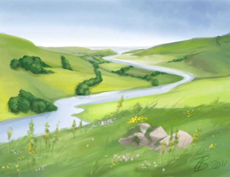
The second bit of work I did yesterday was more straightforward: a simple landscape. Since I'd just finished drawing Sobel, I thought I'd try to connect the landscape a bit, by giving it an English countryside sort of feel. Although I was able to paint the whole thing, it was a pain and a half to do so. My regular tablet has tilt functionality, and the one I'm using now does not. ...Which means I had to go back to my old, less efficient method of painting.

It didn't come out quite like I expected, but in the end, I think it came out pretty well. The sky (done with watercolor tools in Painter) and the river are what I'm most pleased with.


And I still can't wait until my tablet is repaired.