Wednesday, October 27, 2010

Temple Guardian

For the last month or so, I've been working on a new painting featuring the Syäloä species. This one, unlike the last, is a full-body image. I really felt that doing so was necessary, because I wanted to show some of the similarities and differences between this species and humans, and show off more of this species' clothing and adornment.

This was a long, long, long painting. Most of that simply comes down to me changing my mind several times.


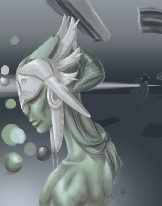
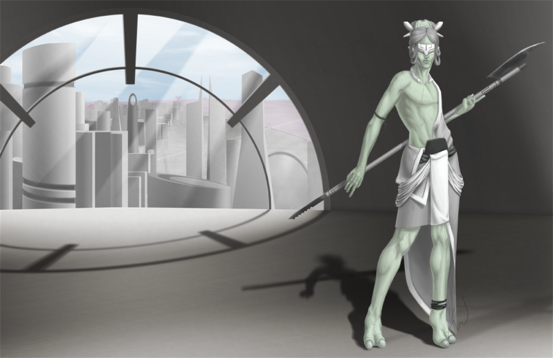
This individual is a seɪwä, or Temple Guardian. The design of the guardian came together easily. I'd already hammered out the anatomy of this species some time ago, so that just left clothing to figure out. I wanted to stick with something kind of like a kilt, so the challenge was making such simple clothing interesting, and keeping it all in greyscale (since they don't utilize color) while still making each piece look separate. I went through a lot of concepts, but the design you see here was the winner.

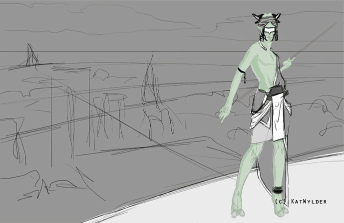
The background here isn't nearly as strong as the character design. Just scrawls roughly where I imagined buildings to be, with the figure standing on a patio that overlooks a city. I ran with this for a time, though, hoping it might come together, later. Sometimes that works out. Many times, it doesn't. In the process GIF below, you'll see some of the different background ideas I went through before finishing the painting.
After finally deciding I didn't like the open patio idea, I went into Blender (it runs nicely on my computer, unlike Maya), and blocked out a new scene. The rectangular shapes were my stand-ins for figures. At one point, I wanted to add another figure--a priestess--but didn't have time to do so. I feel that the final composition here is a lot stronger than what I had before. It also makes a tad more sense to have the character inside the temple. She looked out of place, just chillin' on a patio, before.


And just for fun, here are some additional narrative bits:
Seɪwä were picked from the elite of the warrior class to guard temples, their contents, and the priest class. Today, they serve a largely ceremonial position. However, the pole-arms they carry are not; all seɪwä are highly trained and keep their weapons sharp.

Monday, July 5, 2010

A New Species - Pt. 3

[Continuing from Pt. 2]

EDIT: After getting some great critique on deviantART, I completely reworked the background. It's a vast improvement.


Here's the final image! You can check it out here on my deviantART page.

Tuesday, June 29, 2010

A New Species - Pt. 2

[Continued from Pt. 1]

This particular lady is named län-Ɛyləʊìwä~Sʊnɒkkeɪ Nʊìstɛt Oʊmìshtì. This long "poem name" denotes her position and authority as supreme priestess.

Today, I finished painting and smoothing the headdress, and added the decorative incisions.The big focus on this design is the form of the headdress as something of a wearable sculpture.


[Part 3 continues here: http://katwylder.blogspot.com/2010/06/new-species.html]

Saturday, June 26, 2010

A New Species

I've got a new species to add to the roster for my SF project. If you +devwatch me on deviantART, you've probably seen this species before. (No, not the woman--the fellow beside her.)

This creature is from a species called the Syäloä.

While they could be mistaken for humanoid at a distance, they share only basic biological similarities. One noticeable difference is that females of the species have no breasts. As they do not nurse their young, they have no mammary glands.

Sunday, June 6, 2010

Still Life Pt. 2

Continued from this post...

I've got a huge walkthrough image, this time, that outlines some basic points. After that, I'll get down to some of the details. (Click for full-size.)


If you've read any of my previous, you're probably familiar with my method of picking highlight and shadow colors. It's the same process here, even though I'm not using Corel Painter, instead of PhotoShop.

One cool feature of Painter that's really handy is the mixer pad. It works like a virtual palette, where you can mix colors, rather than the less-than-natural color picker. You can also save your mixer pads for later use.

Most of the highlights in this image were fairly simple. I used a lot more white than normal, because of the strong lighting. Usually, just adding white makes things look chalky. It works perfectly for specular highlights, though, and really makes things look shiny.

Remember, unless your painting physically glows, white is your "brightest" paint. It is perceived as illumination by the brain.

The shadows in this scene were painted in a fairly typical manner. However, unlike the other paintings I've posted here, reflected color is very evident in the shadows. The raspberries have a purple or blue cast to their shadows, and the orange has traces of green in its shadow, where it's close to the grapes.

The green grapes are rather unusual, compared to a lot of objects. They're exhibiting something called subsurface scattering. Rather than just bouncing off, light passes through their skin and is "scattered" before being reflected. You see the same effect when you hold your hand up in front of a bright light.

Objects like this don't have "normal" shadows and highlights. So, it's important to pay extra attention, so you can ensure that they look natural. It's a detail that you may forget if you paint purely from memory.

Another important thing is knowing what not to paint. Raspberries are tricky little buggers. They're made of so many segments, and each has its own highlight and shadow--in the real world. But, this is a painting, and there is such a thing as too much information.

If you're not going for hyper-photo-realism, it's important to learn when to stop. If one part of your painting is over-rendered, compared to the rest, it will look disjointed and become distracting.

Speaking of knowing when to quit, you'll notice that the final image is missing the star of the painting. Because I needed to finish this in time for the workshop, I made the decision to focus on finishing the cluster of fruit first. Poor ugli fruit didn't get finished in time, so it had to be cropped.

The final image for the workshop was printed directly onto canvas, and then stretched over a frame. Acrylic paint was added later to give it some physical texture and make up for some of the printer's limited color gamut.