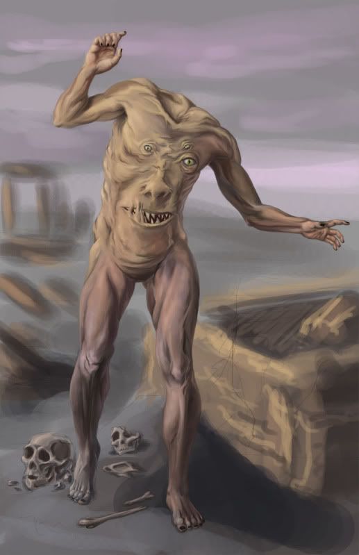
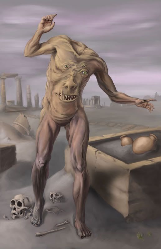
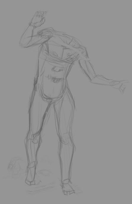
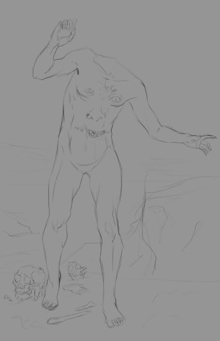
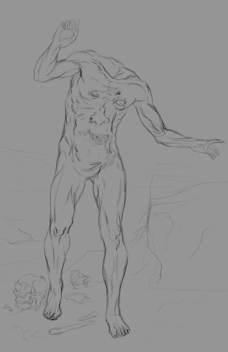
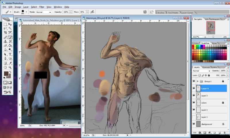
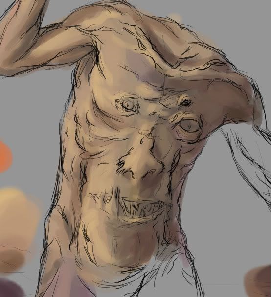
It's been tough finding the time and motivation to paint, lately. So, tonight I sat down and decided to work until I had... something. I started this sketch about a week ago, but hadn't added color. I think this took me about three hours, total?
I don't feel like talking much about the subject of the painting right now, since I'm more focused on the technical aspects of the painting. I feel that my composition could have been better. It was pointed out to me once in a critique that I often have the same sort of POV in most of my paintings, and I can see that here, too--but I think that's something to work on next time.
Showing posts with label color. Show all posts
Saturday, March 31, 2012
Thursday, September 22, 2011
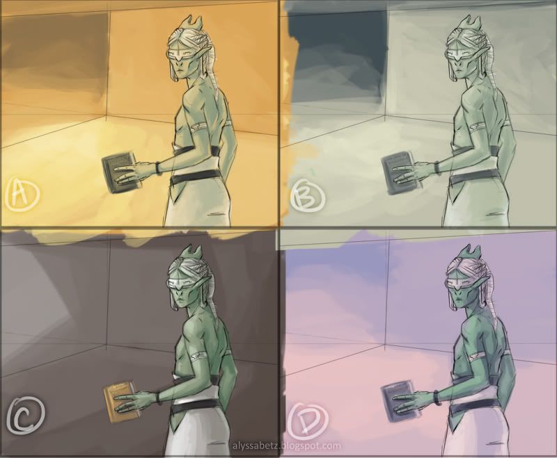
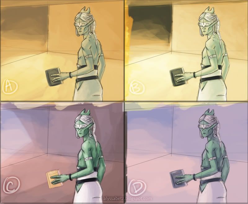
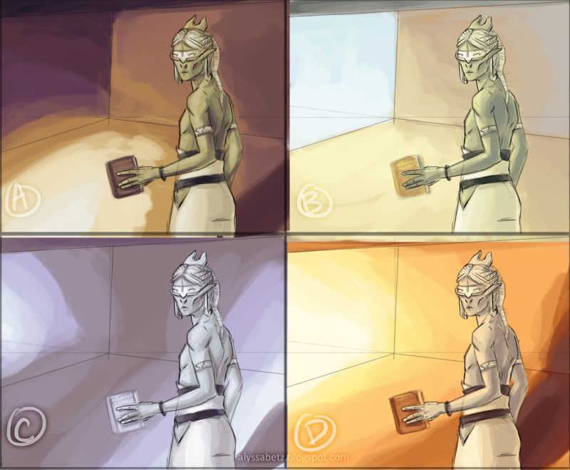
Color Studies
Lately, I've been trying to put some thought into what areas of my work I need to focus on improving. One of those areas, I think, is color. Looking at my art, overall, I feel that I'm sometimes too conservative with my color schemes.
So, I decided to do a few color studies for a sketch I'd done recently. Since each panel only takes about 15 minutes, tops, there's less "commitment" to make everything perfect and more room to be adventurous. There are some technical problems with the lighting in these. (You can tell I kept changing my mind about where the light source was, and what the room was like.) Really, though, I'm just glad I pushed myself to do something different.
For now, I'd be interested to hear opinions from my readers and other artists. Problems aside, is there panel you like best? A panel you think almost works, but could be stronger? Let me know!
So, I decided to do a few color studies for a sketch I'd done recently. Since each panel only takes about 15 minutes, tops, there's less "commitment" to make everything perfect and more room to be adventurous. There are some technical problems with the lighting in these. (You can tell I kept changing my mind about where the light source was, and what the room was like.) Really, though, I'm just glad I pushed myself to do something different.
For now, I'd be interested to hear opinions from my readers and other artists. Problems aside, is there panel you like best? A panel you think almost works, but could be stronger? Let me know!
| Set1 |
| Set1 with layer blending. B is combined with A; C is combined with D |
| Set 2 |
Tuesday, June 29, 2010
A New Species - Pt. 2
[Continued from Pt. 1]
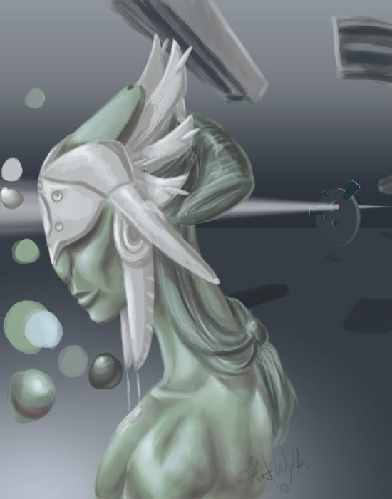
This particular lady is named län-Ɛyləʊìwä~Sʊnɒkkeɪ Nʊìstɛt Oʊmìshtì. This long "poem name" denotes her position and authority as supreme priestess.
Today, I finished painting and smoothing the headdress, and added the decorative incisions.The big focus on this design is the form of the headdress as something of a wearable sculpture.

[Part 3 continues here: http://katwylder.blogspot.com/2010/06/new-species.html]
This particular lady is named
Today, I finished painting and smoothing the headdress, and added the decorative incisions.The big focus on this design is the form of the headdress as something of a wearable sculpture.

[Part 3 continues here: http://katwylder.blogspot.com/2010/06/new-species.html]
Saturday, June 26, 2010
A New Species
I've got a new species to add to the roster for my SF project. If you +devwatch me on deviantART, you've probably seen this species before. (No, not the woman--the fellow beside her.)
This creature is from a species called the Syäloä.
While they could be mistaken for humanoid at a distance, they share only basic biological similarities. One noticeable difference is that females of the species have no breasts. As they do not nurse their young, they have no mammary glands.
This creature is from a species called the Syäloä.
While they could be mistaken for humanoid at a distance, they share only basic biological similarities. One noticeable difference is that females of the species have no breasts. As they do not nurse their young, they have no mammary glands.
Labels:
alien,
anatomy,
color,
digital painting,
exobiology,
figure,
PhotoShop,
portrait,
science fiction,
Syäloä
Sunday, June 6, 2010
Still Life Pt. 2
Continued from this post...
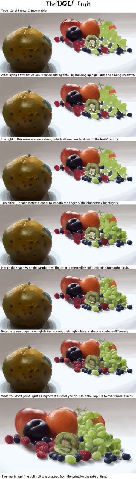
I've got a huge walkthrough image, this time, that outlines some basic points. After that, I'll get down to some of the details. (Click for full-size.)
If you've read any of my previous, you're probably familiar with my method of picking highlight and shadow colors. It's the same process here, even though I'm not using Corel Painter, instead of PhotoShop.
One cool feature of Painter that's really handy is the mixer pad. It works like a virtual palette, where you can mix colors, rather than the less-than-natural color picker. You can also save your mixer pads for later use.
Most of the highlights in this image were fairly simple. I used a lot more white than normal, because of the strong lighting. Usually, just adding white makes things look chalky. It works perfectly for specular highlights, though, and really makes things look shiny.
Remember, unless your painting physically glows, white is your "brightest" paint. It is perceived as illumination by the brain.
The shadows in this scene were painted in a fairly typical manner. However, unlike the other paintings I've posted here, reflected color is very evident in the shadows. The raspberries have a purple or blue cast to their shadows, and the orange has traces of green in its shadow, where it's close to the grapes.
The green grapes are rather unusual, compared to a lot of objects. They're exhibiting something called subsurface scattering. Rather than just bouncing off, light passes through their skin and is "scattered" before being reflected. You see the same effect when you hold your hand up in front of a bright light.
Objects like this don't have "normal" shadows and highlights. So, it's important to pay extra attention, so you can ensure that they look natural. It's a detail that you may forget if you paint purely from memory.
Another important thing is knowing what not to paint. Raspberries are tricky little buggers. They're made of so many segments, and each has its own highlight and shadow--in the real world. But, this is a painting, and there is such a thing as too much information.
If you're not going for hyper-photo-realism, it's important to learn when to stop. If one part of your painting is over-rendered, compared to the rest, it will look disjointed and become distracting.
Speaking of knowing when to quit, you'll notice that the final image is missing the star of the painting. Because I needed to finish this in time for the workshop, I made the decision to focus on finishing the cluster of fruit first. Poor ugli fruit didn't get finished in time, so it had to be cropped.
The final image for the workshop was printed directly onto canvas, and then stretched over a frame. Acrylic paint was added later to give it some physical texture and make up for some of the printer's limited color gamut.
I've got a huge walkthrough image, this time, that outlines some basic points. After that, I'll get down to some of the details. (Click for full-size.)
If you've read any of my previous, you're probably familiar with my method of picking highlight and shadow colors. It's the same process here, even though I'm not using Corel Painter, instead of PhotoShop.
One cool feature of Painter that's really handy is the mixer pad. It works like a virtual palette, where you can mix colors, rather than the less-than-natural color picker. You can also save your mixer pads for later use.
Most of the highlights in this image were fairly simple. I used a lot more white than normal, because of the strong lighting. Usually, just adding white makes things look chalky. It works perfectly for specular highlights, though, and really makes things look shiny.
Remember, unless your painting physically glows, white is your "brightest" paint. It is perceived as illumination by the brain.
The shadows in this scene were painted in a fairly typical manner. However, unlike the other paintings I've posted here, reflected color is very evident in the shadows. The raspberries have a purple or blue cast to their shadows, and the orange has traces of green in its shadow, where it's close to the grapes.
The green grapes are rather unusual, compared to a lot of objects. They're exhibiting something called subsurface scattering. Rather than just bouncing off, light passes through their skin and is "scattered" before being reflected. You see the same effect when you hold your hand up in front of a bright light.
Objects like this don't have "normal" shadows and highlights. So, it's important to pay extra attention, so you can ensure that they look natural. It's a detail that you may forget if you paint purely from memory.
Another important thing is knowing what not to paint. Raspberries are tricky little buggers. They're made of so many segments, and each has its own highlight and shadow--in the real world. But, this is a painting, and there is such a thing as too much information.
If you're not going for hyper-photo-realism, it's important to learn when to stop. If one part of your painting is over-rendered, compared to the rest, it will look disjointed and become distracting.
Speaking of knowing when to quit, you'll notice that the final image is missing the star of the painting. Because I needed to finish this in time for the workshop, I made the decision to focus on finishing the cluster of fruit first. Poor ugli fruit didn't get finished in time, so it had to be cropped.
The final image for the workshop was printed directly onto canvas, and then stretched over a frame. Acrylic paint was added later to give it some physical texture and make up for some of the printer's limited color gamut.
Labels:
color,
Corel Painter,
digital painting,
fruit,
lighting,
still life,
subsurface scattering,
texture
Monday, March 15, 2010
Still Life
I've been meaning to do a still life for some time, so today I ran out to the grocery store and got myself some nifty fruits. I made my selection based on color and texture. (For example, picking green grapes instead of red, to balance out the many red and orange objects.) Also, there's taste. I'm going to eat all of these, eventually.
One of the things I spotted among the aisles is what's called an "Ugli fruit". When I asked an employee how to tell if the fruit is ripe, he explained that the worse it looks the more ripe it is. An idea emerged.
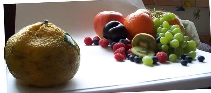
Having obtained my materials, the next step was to photograph it. Today was perfect for photography, because the afternoon was somewhat overcast. To light the scene, I just turned out all the lights in the room and opened the blinds. I then set up the fruit, and took a couple dozen photos at different angles. Different angles convey different emotions, and create different flows of movement. Here's the one I finally settled on.
I made a few edits in PhotoShop: crop, tilt, and focus adjustment. Now, the last one wasn't done with a filter. I simply took two photos at that angle, (one with the background in focus, and one with the foreground in focus), and pasted the focused ugli fruit into the image with an in-focus background.
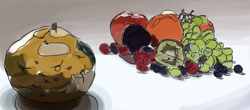
With that done, I just drew a quick sketch of the scene right into PhotoShop, and then added some basic colors to the fruit and background.
The real painting begins in Part 2.
One of the things I spotted among the aisles is what's called an "Ugli fruit". When I asked an employee how to tell if the fruit is ripe, he explained that the worse it looks the more ripe it is. An idea emerged.
Having obtained my materials, the next step was to photograph it. Today was perfect for photography, because the afternoon was somewhat overcast. To light the scene, I just turned out all the lights in the room and opened the blinds. I then set up the fruit, and took a couple dozen photos at different angles. Different angles convey different emotions, and create different flows of movement. Here's the one I finally settled on.
I made a few edits in PhotoShop: crop, tilt, and focus adjustment. Now, the last one wasn't done with a filter. I simply took two photos at that angle, (one with the background in focus, and one with the foreground in focus), and pasted the focused ugli fruit into the image with an in-focus background.
With that done, I just drew a quick sketch of the scene right into PhotoShop, and then added some basic colors to the fruit and background.
The real painting begins in Part 2.
Labels:
color,
Corel Painter,
fruit,
funny,
lighting,
PhotoShop,
still life,
texture,
ugli fruit
Sunday, February 28, 2010
Monster Time! Part 2
Continuing from Part 1, it's time to do the environment and detail work.
The first thing to do is finish laying down rough colors as before. It's important right now to make sure the entire figure is covered with the general colors it should have; it's not important that the brush strokes look nice.

Next, it's time to sketch in a background and add some rough colors to it, as well. This is where the previous step becomes important. Harmony is very important in figurative works. The composition should be balanced, and so should the colors. You want to ensure that the less important areas of the painting don't "compete" with the more important areas, visually. In this painting, the creature is the focus, so it needs to stand out from the background without seeming to "jump out" from the image.

Now is the time when you should really critique the formal elements of your painting. It'll be much easier to fix mistakes now, than later. I'm pretty satisfied with the composition and colors of this piece, so I'm going to begin painting details.
My first concern in this step is to get rid of all my sketch lines. I'm using my regular default brush for this, with the opacity jitter and flow jitter set to my pen pressure. By varying those controls, I can smooth out the rough colors quickly. In areas that need soft transitions between color and shape, I keep my brush at a fairly large size; tighter areas call for a smaller brush.
I also spent some time on the bones. Because they're so close to the figure, they need to be just as detailed as him. For reference, I perused "Skulls Unlimited."
Now comes the really long part of this painting. From here on, it's mostly more of the same work as before. I took more time to refine and polish the figure, and began more detail work on the environment. The environment has a sort of Greco-Roman architecture to it, with lots of columns. In the background, there are a couple of small temple structures. The sky is a little more refined, and way off in the distance is the silhouette of a town. I also added some vases and bits of grass in the foreground for interest.
That's about 99% of the painting. Whenever I get this much of a painting finished I like to take a break and then give it a second look to see what else I can do. One of the last things I did was to "break" the vases. Hellcat pointed out that it didn't look right to have them intact when everything else around is broken and decaying. Sometimes, just doing little things like that really make a painting.
And voila! It's finished!
The first thing to do is finish laying down rough colors as before. It's important right now to make sure the entire figure is covered with the general colors it should have; it's not important that the brush strokes look nice.
Next, it's time to sketch in a background and add some rough colors to it, as well. This is where the previous step becomes important. Harmony is very important in figurative works. The composition should be balanced, and so should the colors. You want to ensure that the less important areas of the painting don't "compete" with the more important areas, visually. In this painting, the creature is the focus, so it needs to stand out from the background without seeming to "jump out" from the image.
Now is the time when you should really critique the formal elements of your painting. It'll be much easier to fix mistakes now, than later. I'm pretty satisfied with the composition and colors of this piece, so I'm going to begin painting details.
My first concern in this step is to get rid of all my sketch lines. I'm using my regular default brush for this, with the opacity jitter and flow jitter set to my pen pressure. By varying those controls, I can smooth out the rough colors quickly. In areas that need soft transitions between color and shape, I keep my brush at a fairly large size; tighter areas call for a smaller brush.
I also spent some time on the bones. Because they're so close to the figure, they need to be just as detailed as him. For reference, I perused "Skulls Unlimited."
Now comes the really long part of this painting. From here on, it's mostly more of the same work as before. I took more time to refine and polish the figure, and began more detail work on the environment. The environment has a sort of Greco-Roman architecture to it, with lots of columns. In the background, there are a couple of small temple structures. The sky is a little more refined, and way off in the distance is the silhouette of a town. I also added some vases and bits of grass in the foreground for interest.
That's about 99% of the painting. Whenever I get this much of a painting finished I like to take a break and then give it a second look to see what else I can do. One of the last things I did was to "break" the vases. Hellcat pointed out that it didn't look right to have them intact when everything else around is broken and decaying. Sometimes, just doing little things like that really make a painting.
And voila! It's finished!
Labels:
anatomy,
bones,
color,
digital painting,
environment,
figure,
horror,
landscape,
monster,
myth
Tuesday, January 5, 2010
Monster time! Part 1
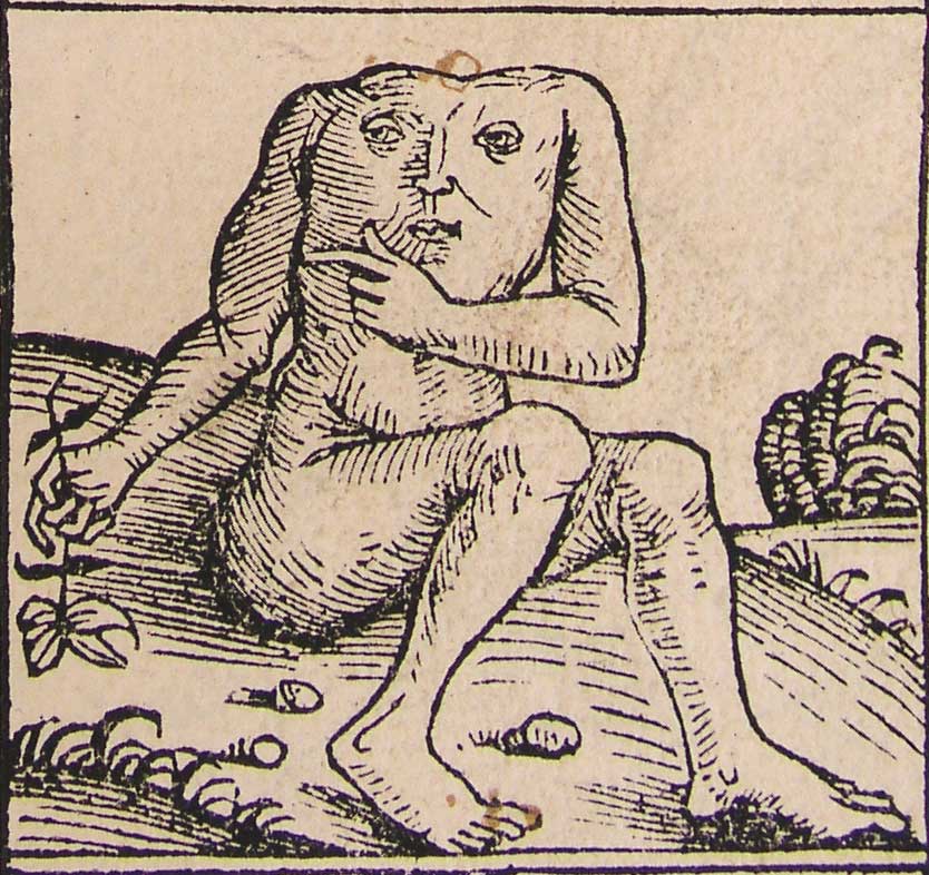
Often, I like to work on several images in parallel to keep myself from getting bored or tired of a single painting. So, today, I started a new one, based on the Greek anthropophage and depictions of the legendary Blemmyes creature.
Horror is not a genre I delve into often, but I figured it's always good to branch out. This creature gives me the chance to do some fairly realistic figure work, and also to take a rather ridiculous monster and try my hand at making it a bit more scary.
My first step was to find a good source image for the pose. I wanted a fairly natural pose, but one that would look slightly "off" in its stance, once I did away with the head. This photo from Felixdeon on dA fit the bill perfectly. The lighting in the shot is also pretty interesting, which is a bonus.
With a pose selected, my next step was to begin my sketch. Starting out rough and gestural is the best way to begin. It's so much easier to fix mistakes when you're at this stage, than when you're five hours into the painting.

Next, I refined my lines and started adding some background objects for interest. The bones are based on various pics from Skulls Unlimited.

I felt pleased with the figure at this point. But as a monster, the image was definitely lacking creepiness. Instead of going for a bloody, gory "ick," I decided to take a different route, and over-emphasize the musculature, veins, and tendons. While muscles are normally thought of as attractive in Western aesthetics, you can take it far enough that it becomes grotesque. For reference, I looked up musculature diagrams and drawings by Michaelangelo. An art instructor of mine once joked that an arm on a Michaelangelo figure looks like a bag of walnuts, because you can see every single muscle. Sounds like a good start towards creepy!

And there we have it! The finished drawing for the figure and a loose background. For the coloring, I referred back to my stock again. (I hope you can all forgive me the sin of censorship, but I'm hosting my images on Photobucket.)

I gave my creature a pale skintone, firstly because it's easiest to match the model, and secondly because veins show best under paler skin.
Despite the skin being pale, though, it's by no means different shades of the same color. It's a combination of several hues. The lights are mostly yellow-oranges, with orange-reds for the midtones, and red-purples for the darks. There are some blues worked into the darks, as well. As I said in my last post, it's really important to use complementary colors.
To begin, I'm just roughly applying color. The play of light is similar to the lighting on the model, but the more exaggerated muscles, (as well as the face, obviously) change things a bit.
Here's a detail view.

That's all for part one! I'll continue with more work on painting the figure and details in Part Two.
Horror is not a genre I delve into often, but I figured it's always good to branch out. This creature gives me the chance to do some fairly realistic figure work, and also to take a rather ridiculous monster and try my hand at making it a bit more scary.
My first step was to find a good source image for the pose. I wanted a fairly natural pose, but one that would look slightly "off" in its stance, once I did away with the head. This photo from Felixdeon on dA fit the bill perfectly. The lighting in the shot is also pretty interesting, which is a bonus.
With a pose selected, my next step was to begin my sketch. Starting out rough and gestural is the best way to begin. It's so much easier to fix mistakes when you're at this stage, than when you're five hours into the painting.
Next, I refined my lines and started adding some background objects for interest. The bones are based on various pics from Skulls Unlimited.
I felt pleased with the figure at this point. But as a monster, the image was definitely lacking creepiness. Instead of going for a bloody, gory "ick," I decided to take a different route, and over-emphasize the musculature, veins, and tendons. While muscles are normally thought of as attractive in Western aesthetics, you can take it far enough that it becomes grotesque. For reference, I looked up musculature diagrams and drawings by Michaelangelo. An art instructor of mine once joked that an arm on a Michaelangelo figure looks like a bag of walnuts, because you can see every single muscle. Sounds like a good start towards creepy!
And there we have it! The finished drawing for the figure and a loose background. For the coloring, I referred back to my stock again. (I hope you can all forgive me the sin of censorship, but I'm hosting my images on Photobucket.)
I gave my creature a pale skintone, firstly because it's easiest to match the model, and secondly because veins show best under paler skin.
Despite the skin being pale, though, it's by no means different shades of the same color. It's a combination of several hues. The lights are mostly yellow-oranges, with orange-reds for the midtones, and red-purples for the darks. There are some blues worked into the darks, as well. As I said in my last post, it's really important to use complementary colors.
To begin, I'm just roughly applying color. The play of light is similar to the lighting on the model, but the more exaggerated muscles, (as well as the face, obviously) change things a bit.
Here's a detail view.
That's all for part one! I'll continue with more work on painting the figure and details in Part Two.
Subscribe to:
Posts (Atom)