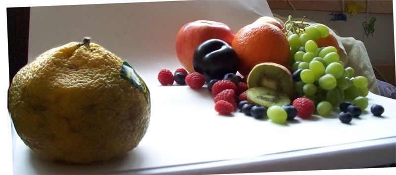
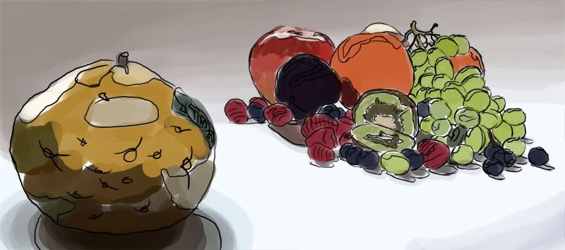
Continued from
this post...
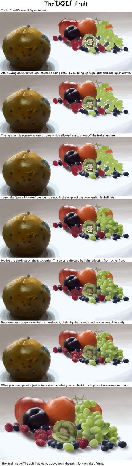
I've got a huge walkthrough image, this time, that outlines some basic points. After that, I'll get down to some of the details. (Click for full-size.)
If you've read any of my previous, you're probably familiar with my method of picking highlight and shadow colors. It's the same process here, even though I'm not using Corel Painter, instead of PhotoShop.
One cool feature of Painter that's really handy is the mixer pad. It works like a virtual palette, where you can mix colors, rather than the less-than-natural color picker. You can also save your mixer pads for later use.
Most of the highlights in this image were fairly simple. I used a lot more white than normal, because of the strong lighting. Usually, just adding white makes things look chalky. It works perfectly for specular highlights, though, and really makes things look shiny.
Remember, unless your painting physically glows, white is your "brightest" paint. It is perceived as illumination by the brain.
The shadows in this scene were painted in a fairly typical manner. However, unlike the other paintings I've posted here, reflected color is very evident in the shadows. The raspberries have a purple or blue cast to their shadows, and the orange has traces of green in its shadow, where it's close to the grapes.
The green grapes are rather unusual, compared to a lot of objects. They're exhibiting something called
subsurface scattering. Rather than just bouncing off, light passes through their skin and is "scattered" before being reflected. You see the same effect when you hold your hand up in front of a bright light.
Objects like this don't have "normal" shadows and highlights. So, it's important to pay extra attention, so you can ensure that they look natural. It's a detail that you may forget if you paint purely from memory.
Another important thing is knowing what not to paint. Raspberries are tricky little buggers. They're made of so many segments, and each has its own highlight and shadow--in the real world. But, this is a painting, and there is such a thing as too much information.
If you're not going for hyper-photo-realism, it's important to learn when to stop. If one part of your painting is over-rendered, compared to the rest, it will look disjointed and become distracting.
Speaking of knowing when to quit, you'll notice that the final image is missing the star of the painting. Because I needed to finish this in time for the workshop, I made the decision to focus on finishing the cluster of fruit first. Poor ugli fruit didn't get finished in time, so it had to be cropped.
The final image for the workshop was printed directly onto canvas, and then stretched over a frame. Acrylic paint was added later to give it some physical texture and make up for some of the printer's limited color gamut.