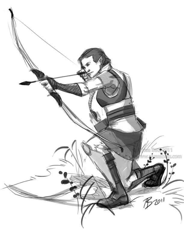
Remember these guys? Since I haven't done much with the characters since their initial designs, I decided some more illustration were in order. I picked Sobel first. Her sketch turned out to be a bit more of a challenge than I expected, but it was a very fun exercise and I learned something in doing it.
The first bit of trouble I ran into was the pose. Because I'm not an archer, I felt that going with a photo reference was a good idea. I wanted to get Sobel's position correct, and knew I'd get something wrong if I tried to draw from my head, or pose in front of a mirror. However, I picked a reference that wasn't too clear in some areas, and ended up paying for that. The face and right leg took the longest to adjust properly, balancing how the model was positioned against what looks correct. That's the "con" of the pose; the "pro" of course, is that it looks very dynamic. Another "pro" is that the model is wearing a sleeveless shirt, so the muscles are visible as the bow is being drawn. (Again, this is a case of photo being preferable to live reference; I am not that buff.)
Ernest helped me quite a bit. He's done about 500% more archery than I have (which is to say, any at all), and was able to give me some tips. One thing that I had completely neglected, initially, was a chest guard. I'd seen them before, but it never registered in my head what they were for. It's sort of ironic, though. In the initial design, I got some flak for not making Sobel's bust noticeable enough (under a chainmail shirt, I might add), so I gave her a bit more definition; this time, I actually scaled it back a little, because the chest guard would compress her bust slightly.
I finished up the sketch with some greyscale shading and, again at Ernest's suggestion, some vegetation to ground her. I'm pretty pleased with this.
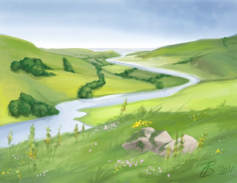
The second bit of work I did yesterday was more straightforward: a simple landscape. Since I'd just finished drawing Sobel, I thought I'd try to connect the landscape a bit, by giving it an English countryside sort of feel. Although I was able to paint the whole thing, it was a pain and a half to do so. My regular tablet has tilt functionality, and the one I'm using now does not. ...Which means I had to go back to my old, less efficient method of painting.
It didn't come out quite like I expected, but in the end, I think it came out pretty well. The sky (done with watercolor tools in Painter) and the river are what I'm most pleased with.
And I still can't wait until my tablet is repaired.
Showing posts with label environment. Show all posts
Thursday, June 2, 2011
Wednesday, October 27, 2010
Temple Guardian
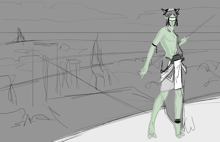
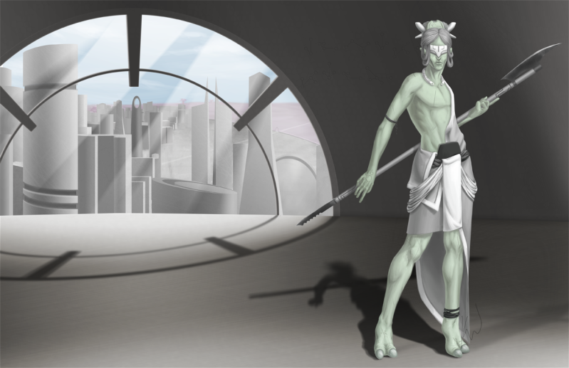
For the last month or so, I've been working on a new painting featuring the Syäloä species. This one, unlike the last, is a full-body image. I really felt that doing so was necessary, because I wanted to show some of the similarities and differences between this species and humans, and show off more of this species' clothing and adornment.
This was a long, long, long painting. Most of that simply comes down to me changing my mind several times.
This individual is a seɪwä, or Temple Guardian. The design of the guardian came together easily. I'd already hammered out the anatomy of this species some time ago, so that just left clothing to figure out. I wanted to stick with something kind of like a kilt, so the challenge was making such simple clothing interesting, and keeping it all in greyscale (since they don't utilize color) while still making each piece look separate. I went through a lot of concepts, but the design you see here was the winner.
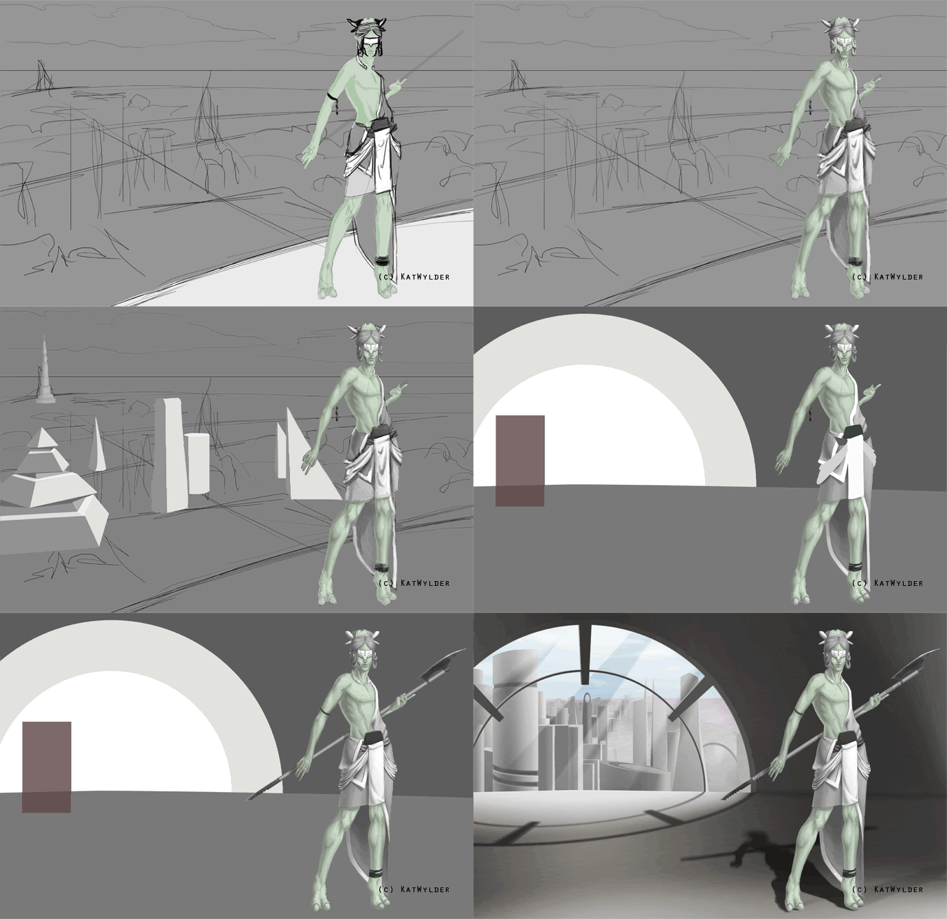
The background here isn't nearly as strong as the character design. Just scrawls roughly where I imagined buildings to be, with the figure standing on a patio that overlooks a city. I ran with this for a time, though, hoping it might come together, later. Sometimes that works out. Many times, it doesn't. In the process GIF below, you'll see some of the different background ideas I went through before finishing the painting.
After finally deciding I didn't like the open patio idea, I went into Blender (it runs nicely on my computer, unlike Maya), and blocked out a new scene. The rectangular shapes were my stand-ins for figures. At one point, I wanted to add another figure--a priestess--but didn't have time to do so. I feel that the final composition here is a lot stronger than what I had before. It also makes a tad more sense to have the character inside the temple. She looked out of place, just chillin' on a patio, before.
And just for fun, here are some additional narrative bits:
Seɪwä were picked from the elite of the warrior class to guard temples, their contents, and the priest class. Today, they serve a largely ceremonial position. However, the pole-arms they carry are not; all seɪwä are highly trained and keep their weapons sharp.
Labels:
alien,
digital painting,
environment,
exobiology,
landscape,
science fiction,
Syäloä
Sunday, February 28, 2010
Monster Time! Part 2
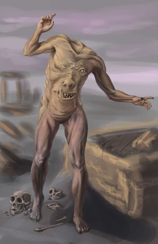
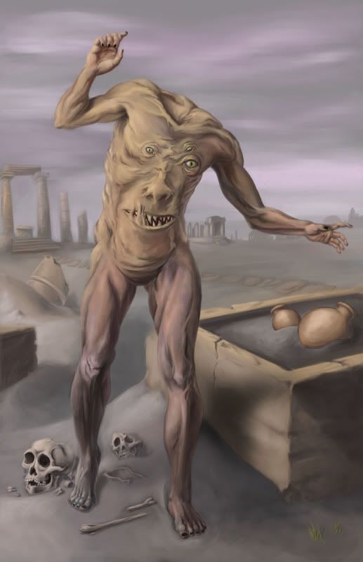
Continuing from Part 1, it's time to do the environment and detail work.
The first thing to do is finish laying down rough colors as before. It's important right now to make sure the entire figure is covered with the general colors it should have; it's not important that the brush strokes look nice.

Next, it's time to sketch in a background and add some rough colors to it, as well. This is where the previous step becomes important. Harmony is very important in figurative works. The composition should be balanced, and so should the colors. You want to ensure that the less important areas of the painting don't "compete" with the more important areas, visually. In this painting, the creature is the focus, so it needs to stand out from the background without seeming to "jump out" from the image.

Now is the time when you should really critique the formal elements of your painting. It'll be much easier to fix mistakes now, than later. I'm pretty satisfied with the composition and colors of this piece, so I'm going to begin painting details.
My first concern in this step is to get rid of all my sketch lines. I'm using my regular default brush for this, with the opacity jitter and flow jitter set to my pen pressure. By varying those controls, I can smooth out the rough colors quickly. In areas that need soft transitions between color and shape, I keep my brush at a fairly large size; tighter areas call for a smaller brush.
I also spent some time on the bones. Because they're so close to the figure, they need to be just as detailed as him. For reference, I perused "Skulls Unlimited."
Now comes the really long part of this painting. From here on, it's mostly more of the same work as before. I took more time to refine and polish the figure, and began more detail work on the environment. The environment has a sort of Greco-Roman architecture to it, with lots of columns. In the background, there are a couple of small temple structures. The sky is a little more refined, and way off in the distance is the silhouette of a town. I also added some vases and bits of grass in the foreground for interest.
That's about 99% of the painting. Whenever I get this much of a painting finished I like to take a break and then give it a second look to see what else I can do. One of the last things I did was to "break" the vases. Hellcat pointed out that it didn't look right to have them intact when everything else around is broken and decaying. Sometimes, just doing little things like that really make a painting.
And voila! It's finished!
The first thing to do is finish laying down rough colors as before. It's important right now to make sure the entire figure is covered with the general colors it should have; it's not important that the brush strokes look nice.
Next, it's time to sketch in a background and add some rough colors to it, as well. This is where the previous step becomes important. Harmony is very important in figurative works. The composition should be balanced, and so should the colors. You want to ensure that the less important areas of the painting don't "compete" with the more important areas, visually. In this painting, the creature is the focus, so it needs to stand out from the background without seeming to "jump out" from the image.
Now is the time when you should really critique the formal elements of your painting. It'll be much easier to fix mistakes now, than later. I'm pretty satisfied with the composition and colors of this piece, so I'm going to begin painting details.
My first concern in this step is to get rid of all my sketch lines. I'm using my regular default brush for this, with the opacity jitter and flow jitter set to my pen pressure. By varying those controls, I can smooth out the rough colors quickly. In areas that need soft transitions between color and shape, I keep my brush at a fairly large size; tighter areas call for a smaller brush.
I also spent some time on the bones. Because they're so close to the figure, they need to be just as detailed as him. For reference, I perused "Skulls Unlimited."
Now comes the really long part of this painting. From here on, it's mostly more of the same work as before. I took more time to refine and polish the figure, and began more detail work on the environment. The environment has a sort of Greco-Roman architecture to it, with lots of columns. In the background, there are a couple of small temple structures. The sky is a little more refined, and way off in the distance is the silhouette of a town. I also added some vases and bits of grass in the foreground for interest.
That's about 99% of the painting. Whenever I get this much of a painting finished I like to take a break and then give it a second look to see what else I can do. One of the last things I did was to "break" the vases. Hellcat pointed out that it didn't look right to have them intact when everything else around is broken and decaying. Sometimes, just doing little things like that really make a painting.
And voila! It's finished!
Labels:
anatomy,
bones,
color,
digital painting,
environment,
figure,
horror,
landscape,
monster,
myth
Subscribe to:
Posts (Atom)