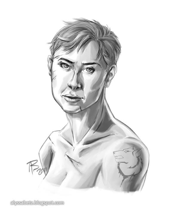
Here's a little bit of what I've been working on, over the past week. After finishing up
Sobel, I did a character sketch of Myron.
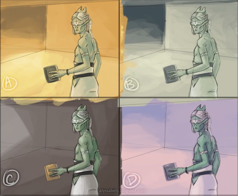
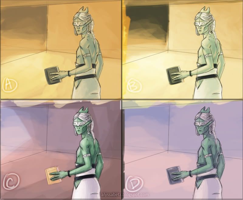
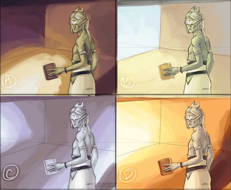
I spent a lot more time on this one, playing around with a larger scene. Ultimately, though, I scrapped the idea and went back to the simpler spot illustration style I used with Sobel. It was a little frustrating at first. I felt as though I'd wasted a lot of time fiddling around with something that didn't make it into the piece. Then I remembered how
Tom Jech advised us, when he visited BGSU this past semester, that the difference between student and professional work is often what you
don't include. It's good advice that I think I'm starting to internalize.
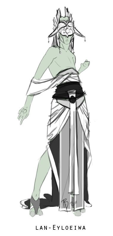
The next sketch that I worked on is a few months older: the clothing design for the High Priestess of the Syäloä, län-Eyloeiwä I started this one at the same time as the others, but felt unsure about how to finalize the design. I spent a few minutes on it again this week, and feel quite confident about the design. She shares some elements of dress with the temple guardians. This also shows, when compared with the other outfits, a cultural element of hierarchy through dress--the higher an individual's status, the more clothing they wear. This is a common practice in many real-world societies.
You can see the previous clothing concepts
here; the Temple Guardian
here; and the High Priestess
here.


